This blog post is about my latest artistic creations, a new collection I call “The Remixes.”
As 2018 started to wind down, I realized that I had gone an entire year without a new drawing or work of art. While there are many different reasons why I have not sat down at my desk and committed to something grand, I felt like it had been too long since I last let out my inner artist.
This post is a showcase and background into my latest collection – where I went back in time through all of my large scale drawings and put a different spin or twist on them. Each of these pieces took probably between 5-10 hours per piece, which gives me a nice bit of work to release as a single unit. Below, I detail my thought processes on each work and how it evolved in my head, and utilizing only photoshop and a bit of creative juices ended up where I am today.
My Cardinal Home Remix
The Original:
The Remix:
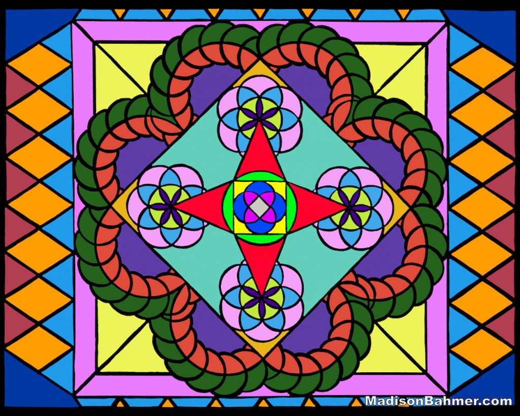
This was actually the first piece I did of this series, and I originally started off with the idea that I was going to recolor the existing pattern as is. While that is not out of the question, I felt like this piece is complex enough as it is and therefore wanted something a bit simpler, but with the same look and feel.
Instead, I went for a stained-glass style look, where I filled in each of the patterned shaped with a new color. I replaced the background with black instead of white, trying to give it a look like you would see in a church window. If you notice the colors are a bit more organic and soft, and not so harsh on the eyes as well. I think this actually turned out better than I expected, given that the drawing itself is a simplification of the prior one.
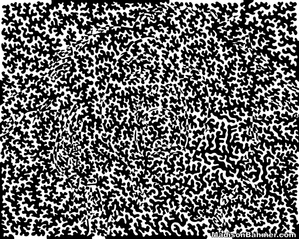
Binary Fracture Remix
The Original:
The Remix:
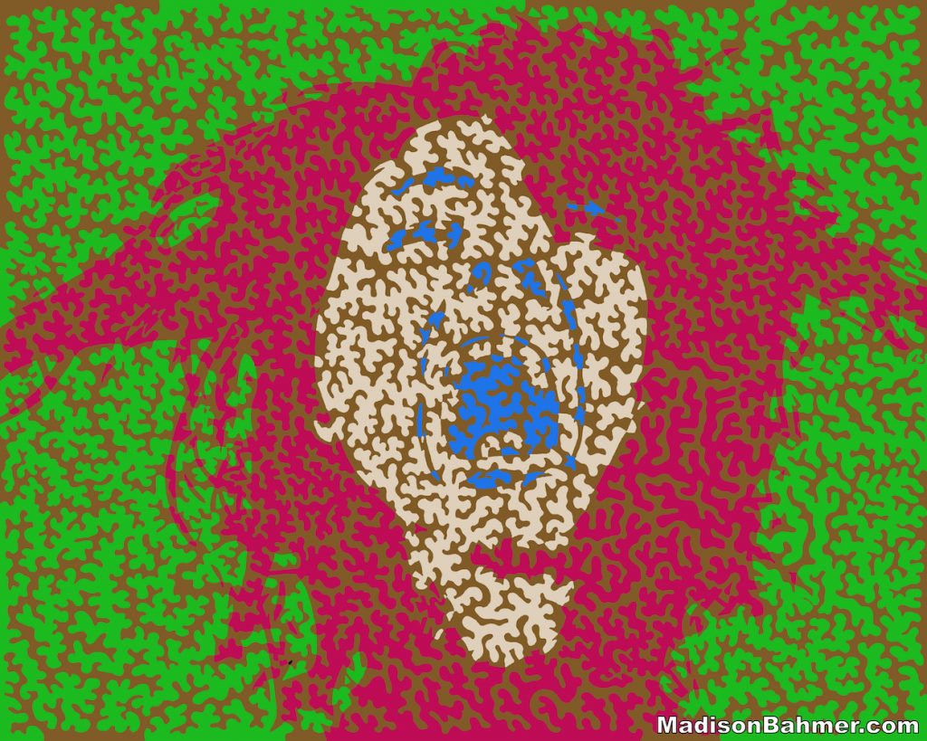
I felt like this piece deserved some color and some pop to the original image that is hidden underneath it. Much in the same way that my DYSWIS drawing takes a bunch of squiggly lines and creates an image from the shadows of a picture, Binary Fracture had an image hidden within it the entire time. This new colorized version hopefully helps shed light onto something that was otherwise hidden in the original picture.
The original drawing depicts a woman pulling her hair out, eyes squinted and shouting while her world is fractured between black and white. This colorized version has a nice brown tone that flows through the entire piece, giving it a much more relatable element to it. I tried to keep a bit of color contrast in this piece, although I know the colors are not very conventional for a human-like figure. I think most people when they see this will be surprised that this figure has been hidden there the entire time.
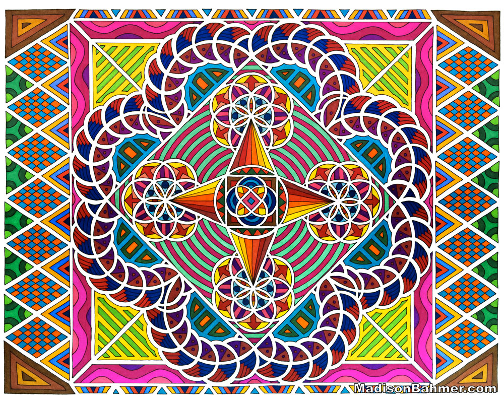
Lovegarithmic Remix
The Original:
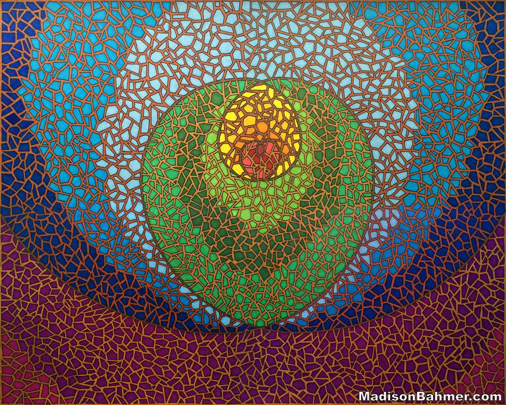
The Remix:
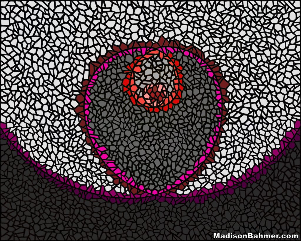
In this remix of Lovegarithmic I wanted to go for a more stone-like, masonry feel since the tiles create such a nice mosaic pattern. I didn’t want to lose the original intention of the piece, which meant that I still needed to include a warm lovey feeling to it while switching up the colors a bit.
I decided that I would outline both sides of the original golden spirals a different shade of red, ranging from pinks, reds, and purples that would help etch in the path of the spiral as it traveled outwards. Almost like in the movies when you pour gasoline down a long trail and then throw a burning match in to it. The path lights up with flames, in the same way that the love for this piece burns through the spiral’s paths. With the focal point being the red heart in the center, it gives this piece a more simple look, but I like how it turned out.
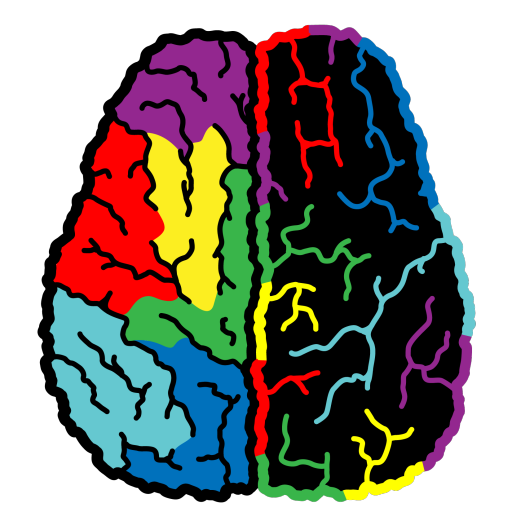
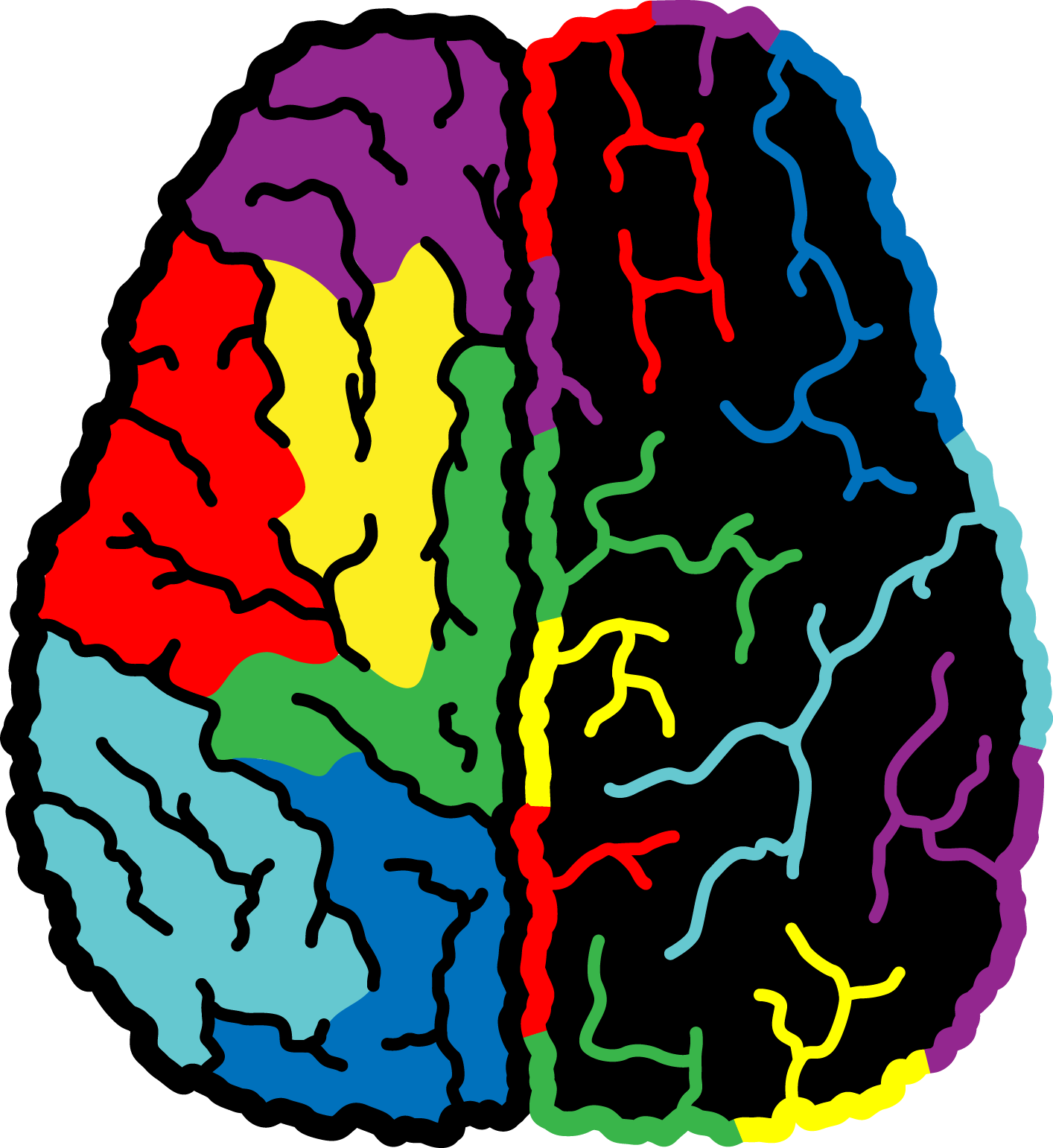
DYSWIS Remix
The Original:
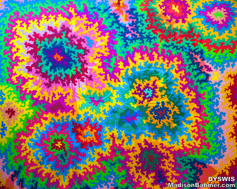
The Remix:
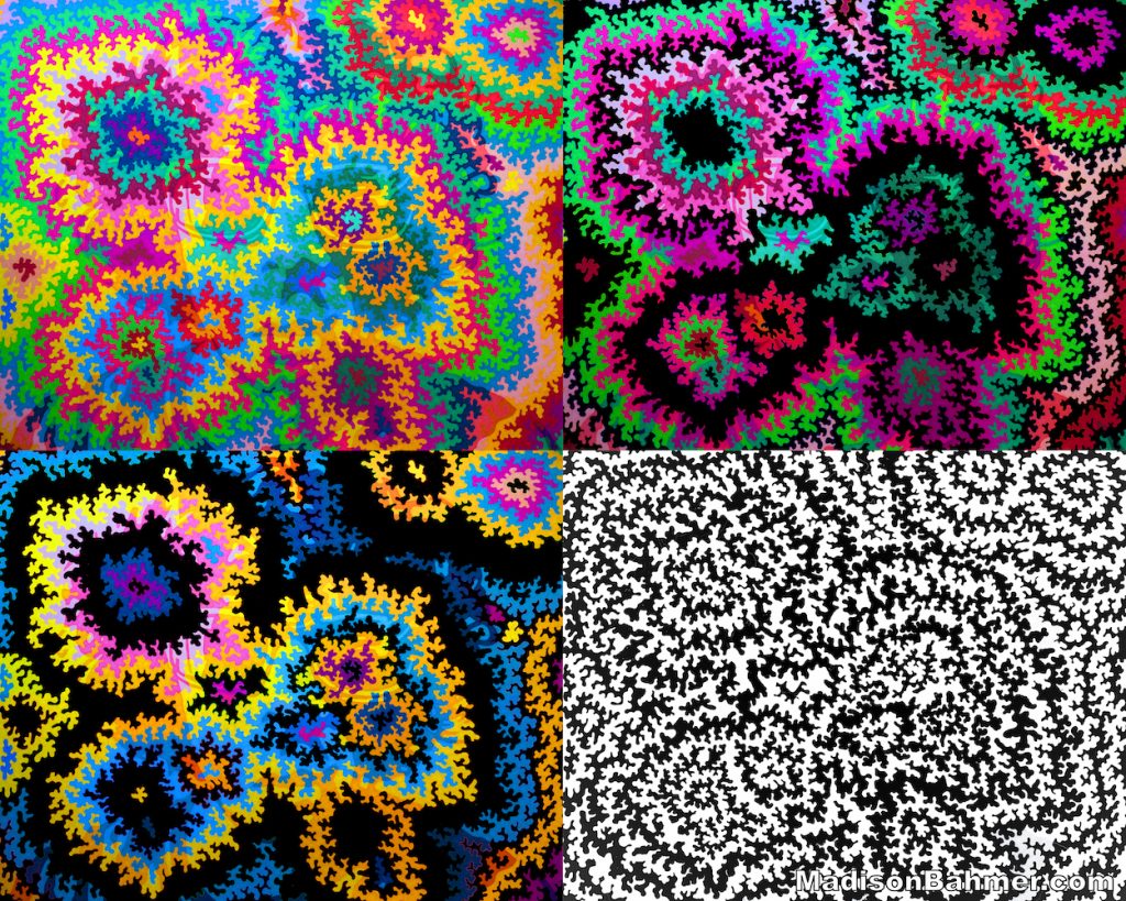
For this piece I decided that I wanted to split the work into four quadrants, each encapsulating a different style of the original drawing. My underlying theme here is color blindness, and each of the four areas represent different ways of seeing the same drawing depending on if you do or do not have a condition which hinders your ability to see color.
In the upper left corner is the original piece in all of its colors. The upper right piece consists mostly of shades of red and green, as I blacked out all of the other colors within the drawing. To someone with Red-Green Color Blindness, the goal was to make the upper right section pretty much impossible to see. In a similar manner, someone with Blue-Yellow Color Blindness would have an extremely hard time distinguishing the bottom left piece, as I tried my best to block out everything that was explicitly red or green, and tried to just leave shades of yellow and blue.
The bottom right corner then is an abstract representation of Total Color Blindness, in which it is impossible to distinguish the face behind the original drawing regardless of color. Again, I really like how these pieces came out, and all four of them are full size as well and would look great on a phone case, tapestry, or hanging on a wall.
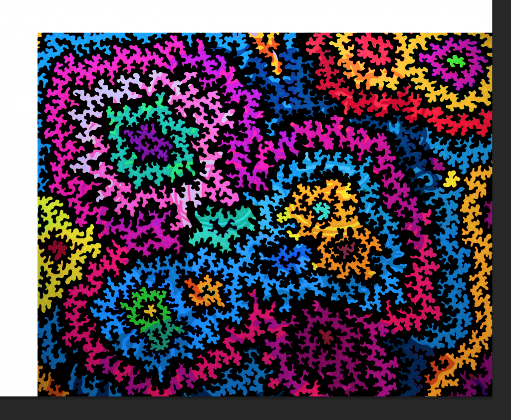
While I was making this remix, I thought this was a cool looking temporary piece, where I had colored every other line in as black.
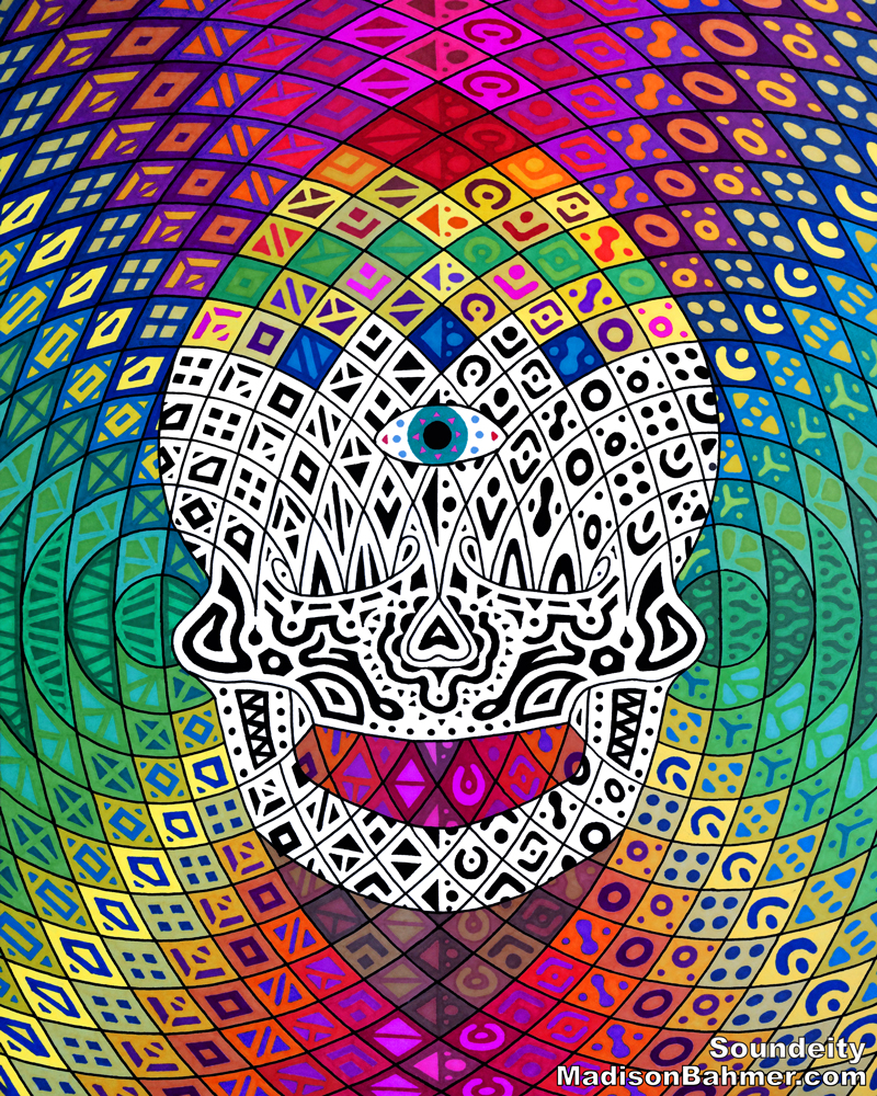
Soundeity Remix
The Original:
The Remix:
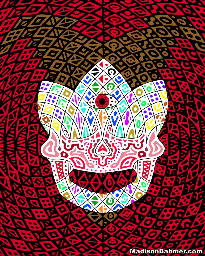
With this remix I wanted to give the underlying skull a new look and feel, but with a more demonic feel. Here, I removed almost all of the colors from the patterned background, and instead replaced it with a checkered red and black pattern. This immediately gave the design a more menacing look, and I decided to replace the jeweled crown with devil horns as well.
While trying to think about how I could get some additional color back into this piece, I decided that the patterns on the face could be colored instead of black like in the original one. I think this makes it almost clown-like, as clowns are typically the ones with a very white base and colorful painting on top of their face. The end result almost is like some kind of demon-clown, which more than meets the expectations I had going in to making this piece.
![]()
Here is a midway point during the process that I also thought looked cool, which is a combination of the black and red checkered background while the colored pattern remains.
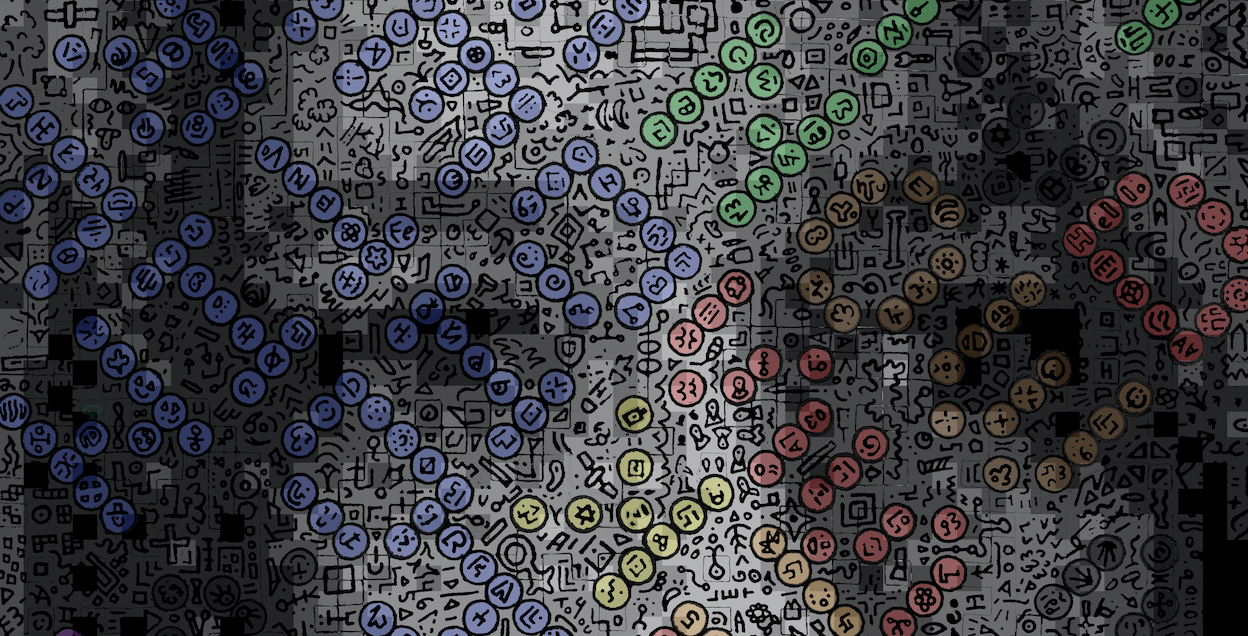
Pixelated Thoughts Remix
The Original:
![]()
The Remix:
![]()
This remix was actually the last remix I did, as I was procrastinating on the most difficult one of them all. For my vision for this piece, I wanted to extract out the overlay pattern from the face, so I could manipulate the colors, swap the face out, and give this one a unique twist.
I found another picture of my original subject, this time in yet another confused facial expression, and used some old scripts to run the same ordered 2×2 dither on top of the face to turn it grayscale and turn it into a desired set of 7 colors. Once I extracted the pattern out from the original piece, I changed it to black and then colored in the sayings hidden within the drawing with 4 unique colors. Each color represents a saying from the original piece (you may have to turn your head), and where the letters are used more than once the colors mix and turn a different shade. For example, the red saying near the bottom left and the blue saying in the upper left share two letters, which have turned purple.
I think this is the most radically different piece of all of them, but it still retains the underlying message.
Liquid Daze Remix
The Original:
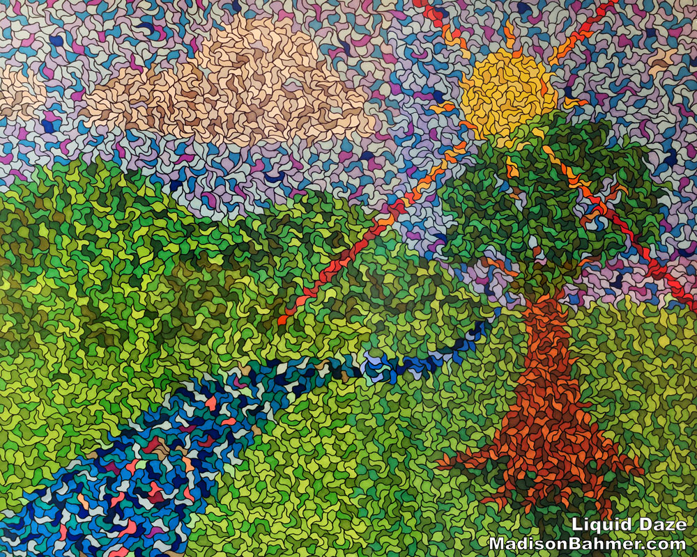
The Remix:
For Liquid Daze, my vision with this work has always been that you can apply it to literally any picture and take the original concepts for the work, and create something new and awesome. Here, I found a picture from my camera roll that was the location for the original inspiration of this piece – a 2015 trip to Bonnaroo – and crafted it into the rainbow arch that greets everyone as they walk into the festival grounds.
Hopefully you can still see the arch, the people in line, the famous What Stage, the concession stands that line the distance, and everything in between. I had do some some cropping and additional work in Adobe Illustrator in order to get this piece under control, which is why the lines are slightly thicker and the blobs are slightly bigger than in the original drawing.
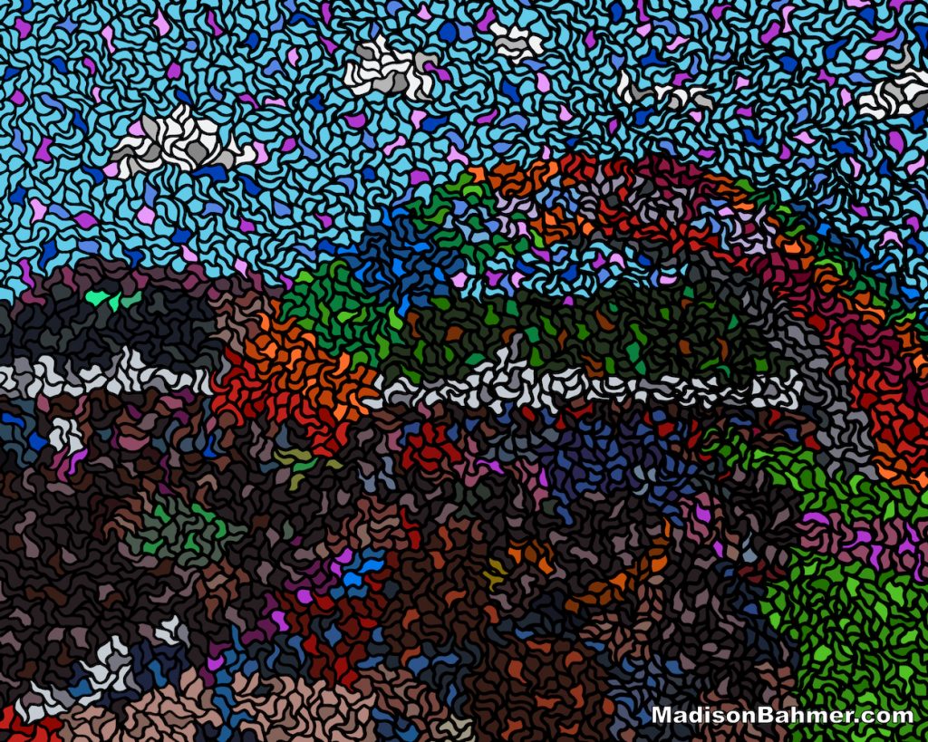
This piece was not without hardship however, as my computer locked up during the saving process once it was complete. During the lock up, the file was corrupted and unable to be recovered in any way, thus creating a jumble of bits where my original work stood.
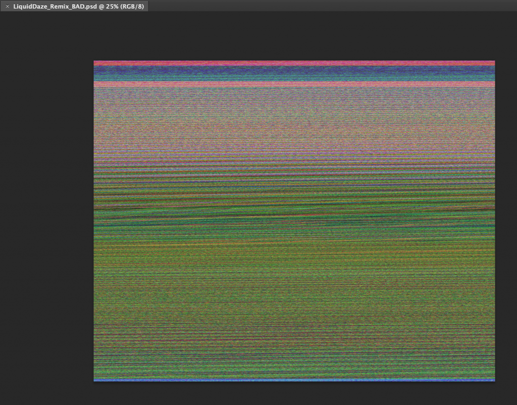
Hours of work down the drain, and I had to recreate the entire thing from scratch… which was a real damper on what otherwise was an awesome piece. While I tried to recreate it as best I could, it is a slightly different take on what I originally came up with below.
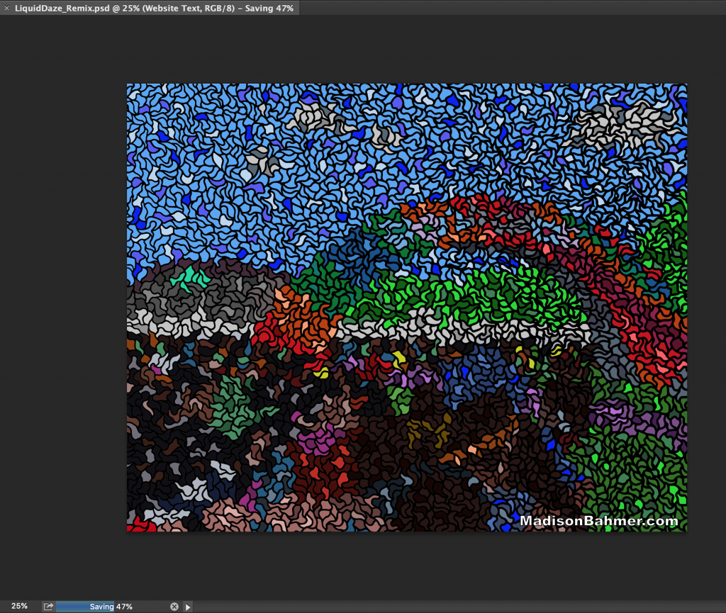
You can see this is actually “stuck” saving, which cause the corrupted result prior. I think the second round is better, and am happy I got a second shot at it.
Overall, I am extremely happy with how everything came out. This has and always will be a labor of love, and am glad I get to start 2019 off with a bang. These pieces are not perfect, they most certainly have some artifacts or a little bit missing here or there, but overall I think they can all stand on their own and am happy to add them all to my collection.
